> For the complete documentation index, see [llms.txt](https://awecommerce.gitbook.io/awe-color-swatches/llms.txt). Markdown versions of documentation pages are available by appending `.md` to page URLs; this page is available as [Markdown](https://awecommerce.gitbook.io/awe-color-swatches/getting-started/option-styles/swatch-styles.md).

# Swatch styles explained

What each option style looks like and when to use it.

Each option can use a different style on the product page and on collection cards.

***

## 1. **The styles**

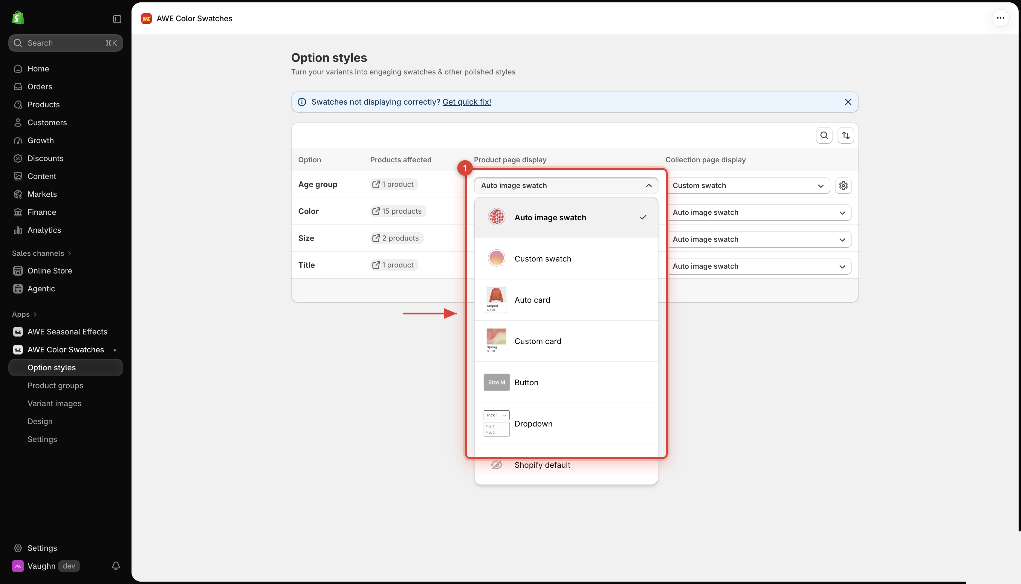
<figure><img src="https://1584372634-files.gitbook.io/~/files/v0/b/gitbook-x-prod.appspot.com/o/spaces%2FQtSZ9l9Z5zXeyqTQcvze%2Fuploads%2Fgit-blob-0cbad4032ea33fe143baf1fcb2a04ebcda320cc5%2Foption-styles-02-style-menu.png?alt=media" alt="Style menu for an option"><figcaption></figcaption></figure>

<table data-header-hidden><thead><tr><th width="190"></th><th></th></tr></thead><tbody><tr><td><strong>Auto image swatch</strong></td><td><ul><li>A small swatch showing each value's <strong>variant image</strong>. No setup needed.</li><li>Great for: colors and patterns when every variant has its own photo.</li></ul></td></tr><tr><td><strong>Custom swatch</strong></td><td><ul><li>A small swatch showing the color, two colors or image <strong>you</strong> set for each value.</li><li>Great for: clean color dots, or when variant photos don't show the color well.</li></ul></td></tr><tr><td><strong>Auto card</strong></td><td><ul><li>A card with the variant image and the value name below it.</li><li>Great for: materials, prints or styles that need a name.</li></ul></td></tr><tr><td><strong>Custom card</strong></td><td><ul><li>A card with your own color or image and the value name.</li></ul></td></tr><tr><td><strong>Button</strong></td><td><ul><li>A text button for each value.</li><li>Great for: sizes like S, M, L.</li></ul></td></tr><tr><td><strong>Dropdown</strong></td><td><ul><li>A tidy drop-down menu.</li><li>Great for: options with many values.</li></ul></td></tr><tr><td><strong>Shopify default</strong> (product page)</td><td><ul><li>The app leaves this option alone — your theme's own picker shows.</li></ul></td></tr><tr><td><strong>No show</strong> (collection page)</td><td><ul><li>No swatches for this option on product cards.</li></ul></td></tr></tbody></table>

→ ***Custom swatch** and **Custom card** show a gear icon next to the dropdown — click it to set the colors and images. See* [*Custom colors & images*](/awe-color-swatches/getting-started/option-styles/custom-colors-and-images.md)*.*

## 2. **On the product page**

The swatches replace your theme's picker for that option. Selecting a swatch changes the variant just like the theme would — image, price and Add to cart all update.

## 3. **On collection cards**

Swatches show on product cards in collections, search results, the home page, related products and cart drawers.

* **Hover** a swatch to preview that variant's image on the card.
* **Click** a swatch to switch the card's image, link, price and sold-out badge.

→ *Too many swatches on a card? Use* [*Compact display*](/awe-color-swatches/getting-started/design/compact-display-on-collection-cards.md)*.*

## 4. **Change how a style looks**

Shape, size, spacing and colors are set per style in [Design](/awe-color-swatches/getting-started/design.md): **Swatch** (Auto image swatch & Custom swatch), **Card** (Auto card & Custom card), **Button** and **Dropdown**.

***

💬 If you have any related questions, please contact us via **Live chat** in the app.