> For the complete documentation index, see [llms.txt](https://awecommerce.gitbook.io/awe-color-swatches/llms.txt). Markdown versions of documentation pages are available by appending `.md` to page URLs; this page is available as [Markdown](https://awecommerce.gitbook.io/awe-color-swatches/getting-started/design/swatch.md).
# Swatch
Shape, size, spacing and border colors of color and image swatches.
The **Swatch** design is used by **Auto image swatch** and **Custom swatch** — the small circles or squares that show a color or a picture.
To get started:\
**Design** → **Swatch** → **Custom**. Pick the **Product page** or **Collection page** tab.
***
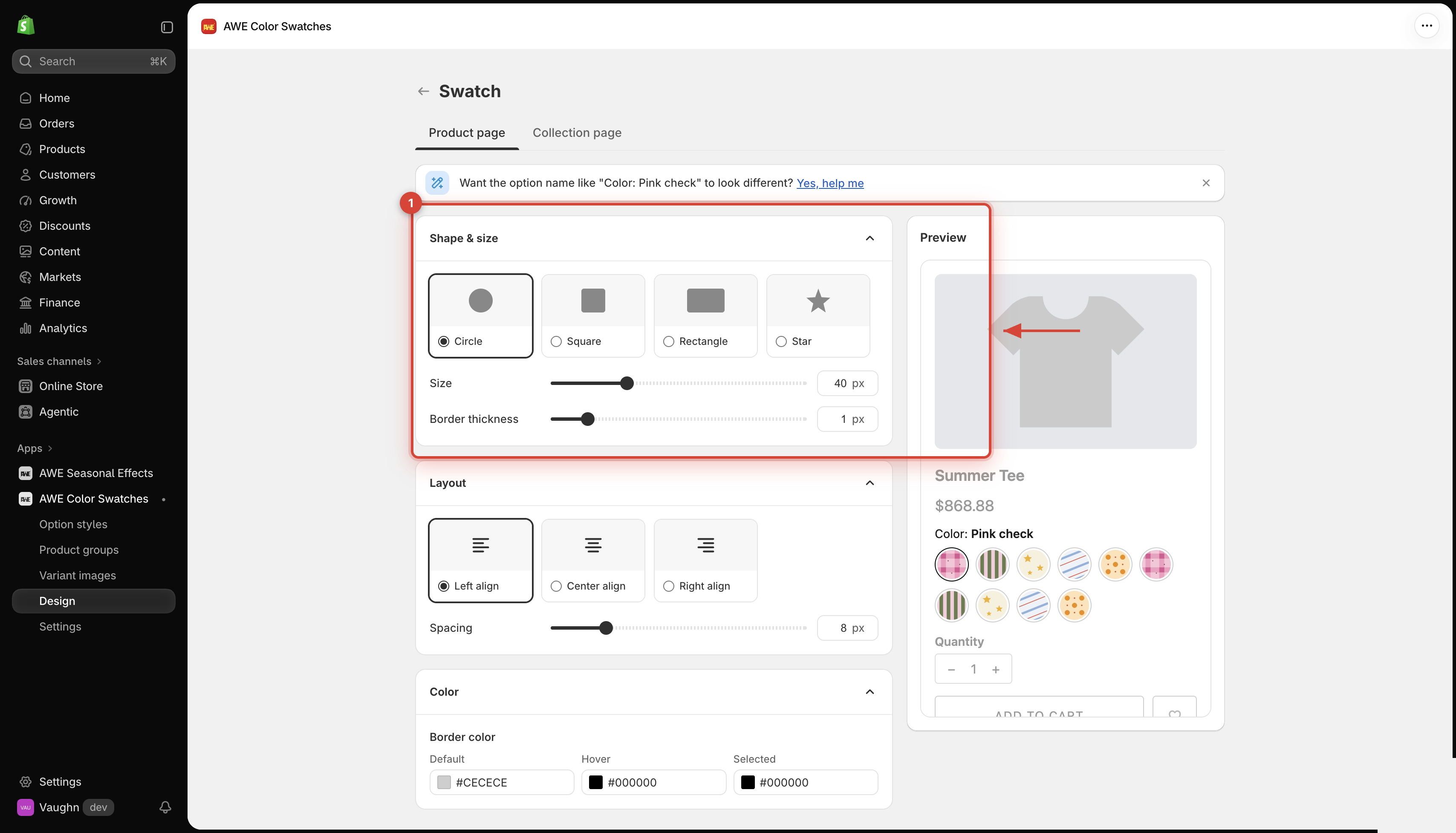
## 1. **Shape & size**
### **1.1 Shape**
**Circle** (default), **Square**, **Rectangle** or **Star**.
### **1.2 Size**
Size
For Circle, Square and Star: 8–120 px.
Default: 40 px on the product page, 24 px on the collection page.
Width size / Height size
For Rectangle: 8–120 px each.
Corner radius
For Square and Rectangle: 0–40 px (default 0).
Border thickness
0–8 px (default 1).
→ *Swatches keep the size you set on mobile too — make sure they're big enough to tap easily on a phone.*
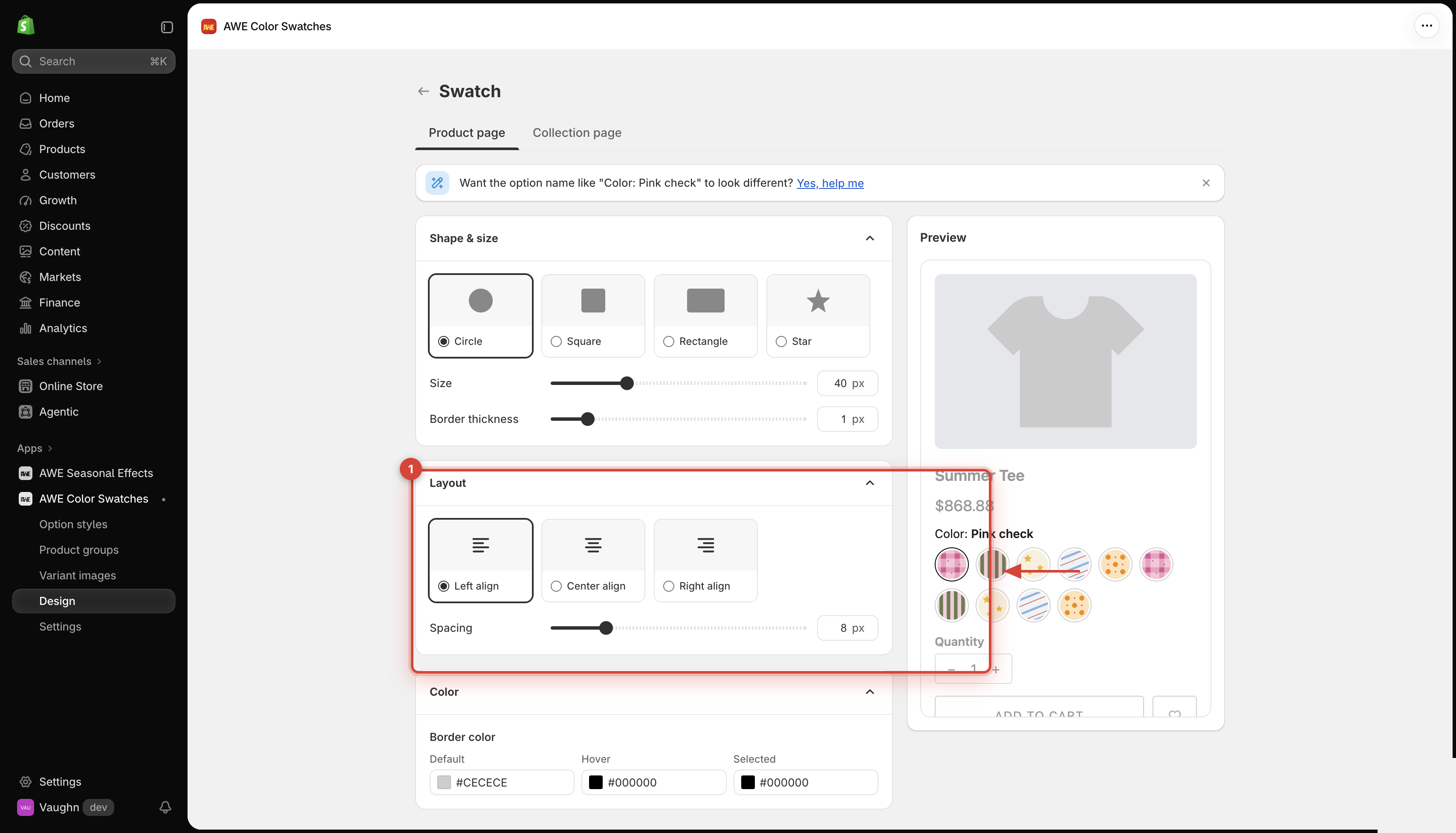
## 2. **Layout**
* **Alignment**: **Left** (default), **Center** or **Right**.
* **Spacing**: the gap between swatches, 0–40 px (default 8).
## 3. **Compact display**
Only on the **Collection page** tab. Keeps busy product cards tidy — see [Compact display on collection cards](/awe-color-swatches/getting-started/design/compact-display-on-collection-cards.md).
## 4. **Color**
**Border color** has 3 states — **Default**, **Hover** and **Selected** (defaults `#CECECE` / `#000000` / `#000000`). Click a color to pick it or type a hex code.
→ *The selected swatch is shown by its border, so pick a **Selected** color that stands out from your swatches.*
***
💬 If you have any related questions, please contact us via **Live chat** in the app.