> For the complete documentation index, see [llms.txt](https://awecommerce.gitbook.io/awe-color-swatches/llms.txt). Markdown versions of documentation pages are available by appending `.md` to page URLs; this page is available as [Markdown](https://awecommerce.gitbook.io/awe-color-swatches/getting-started/design/dropdown.md).
# Dropdown
Width, height and colors of the dropdown option picker.
The **Dropdown** design is used when an option shows as a drop-down menu.
To get started:\
**Design** → **Dropdown** → **Custom**. Pick the **Product page** or **Collection page** tab.
***
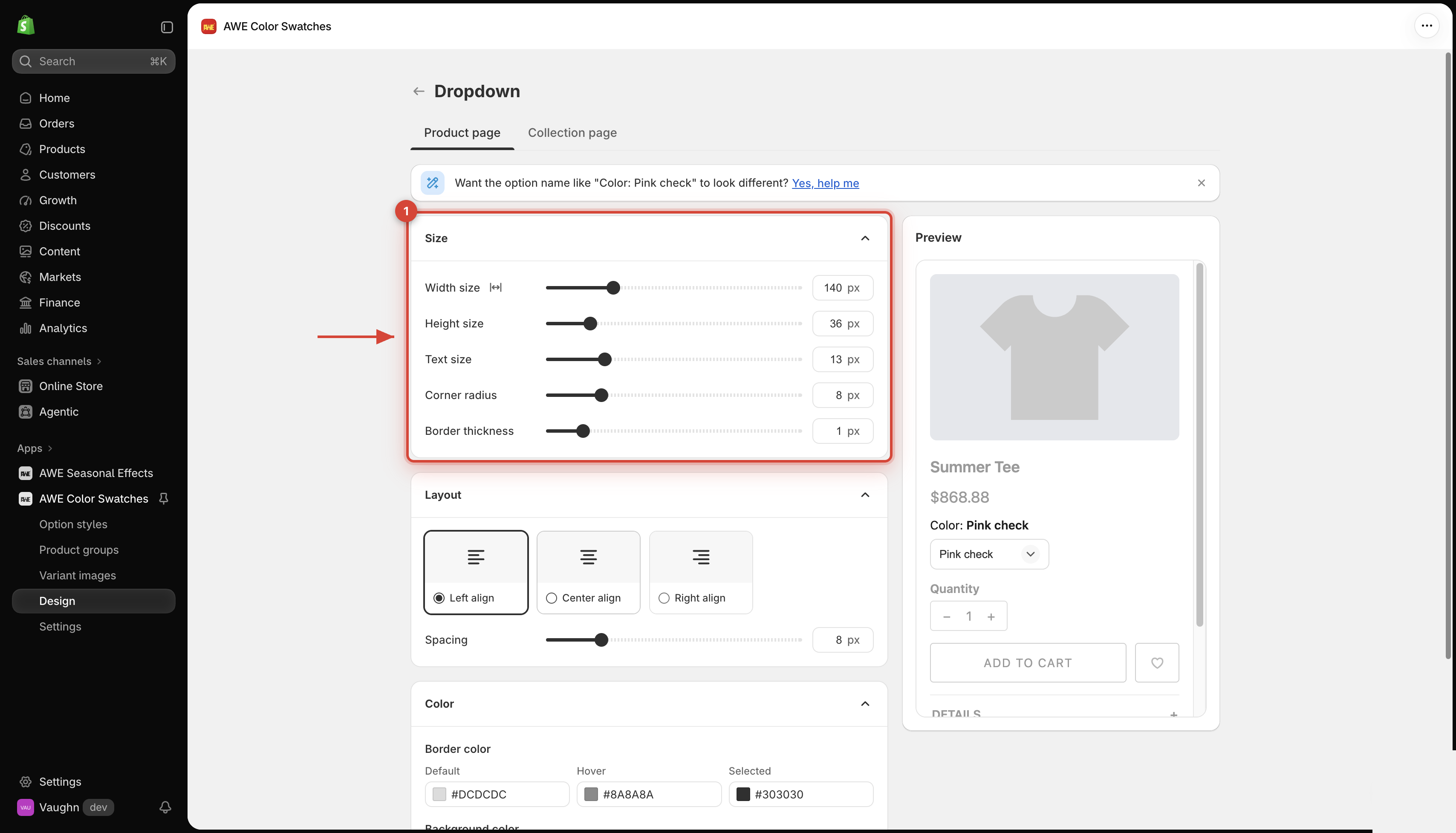
## 1. **Size**
Width size
80–320 px (default 140). The dropdown never grows wider than its space.
Click the Full width icon next to the label to stretch it to the full width instead.
Height size
28–80 px (default 36).
Text size
10–24 px (default 13).
Corner radius
0–40 px (default 8).
Border thickness
0–8 px (default 1).
## 2. **Layout**
* **Alignment**: **Left** (default), **Center** or **Right**.
* **Spacing**: 0–40 px (default 8).
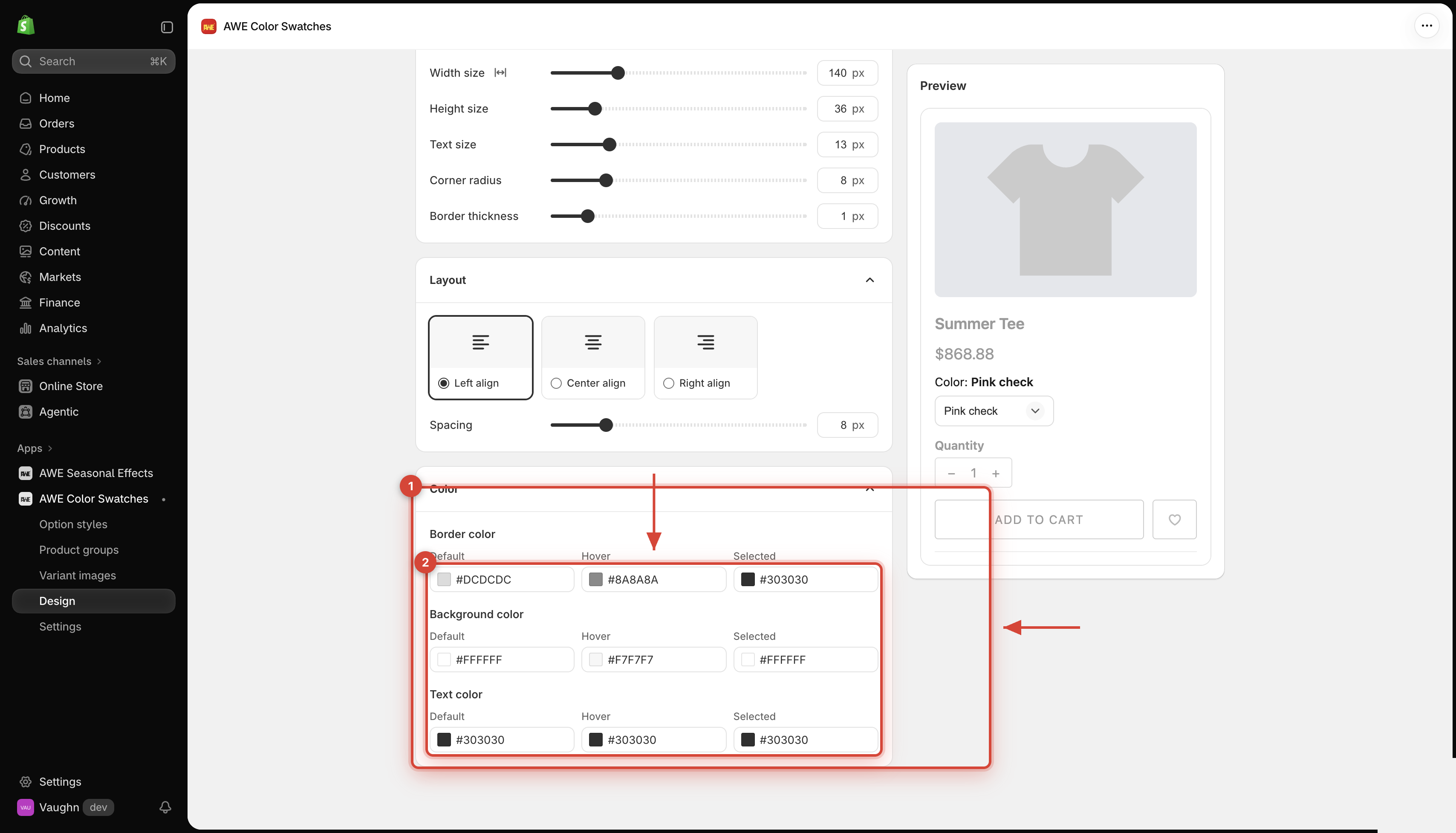
## 3. **Color**
**Border color**, **Background color** and **Text color**, each with **Default**, **Hover** and **Selected** states.
## 4. **Good to know**
* The dropdown shows text only, with a check mark next to the selected value. Before anything is picked it reads **Select**.
* Sold-out values show **Out of stock** or a strike line, depending on your **Sold-out variant display** in [Settings](/awe-color-swatches/getting-started/settings.md).
* The dropdown is already compact, so it has no Compact display section.
***
💬 If you have any related questions, please contact us via **Live chat** in the app.