> For the complete documentation index, see [llms.txt](https://awecommerce.gitbook.io/awe-color-swatches/llms.txt). Markdown versions of documentation pages are available by appending `.md` to page URLs; this page is available as [Markdown](https://awecommerce.gitbook.io/awe-color-swatches/getting-started/design.md).
# Design
Fine-tune how each swatch style looks on product and collection pages.
Once an option shows as swatches, **Design** lets you fine-tune how each style looks — shape, size, spacing and colors — with a live preview.
To get started:\
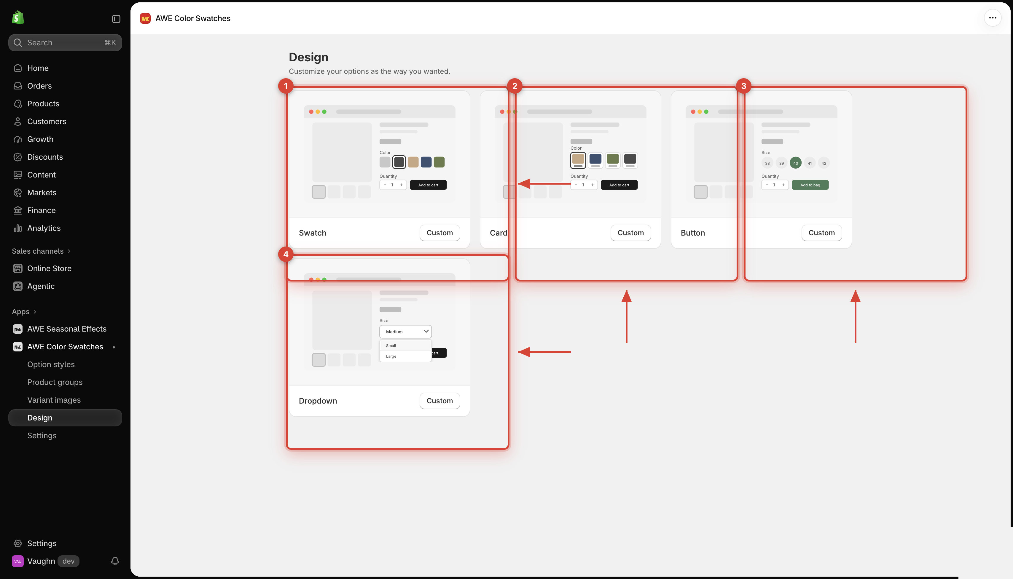
Go to **Design** in the app menu, then click **Custom** on the style you want to change: **Swatch**, **Card**, **Button** or **Dropdown**.
***
## 1. **One design per style**
Swatch
Used by Auto image swatch and Custom swatch.
Card
Used by Auto card and Custom card.
Button
Used by Button.
Dropdown
Used by Dropdown.
A design applies to every option and product group that uses that style, across your whole store.
## 2. **Product page and Collection page**
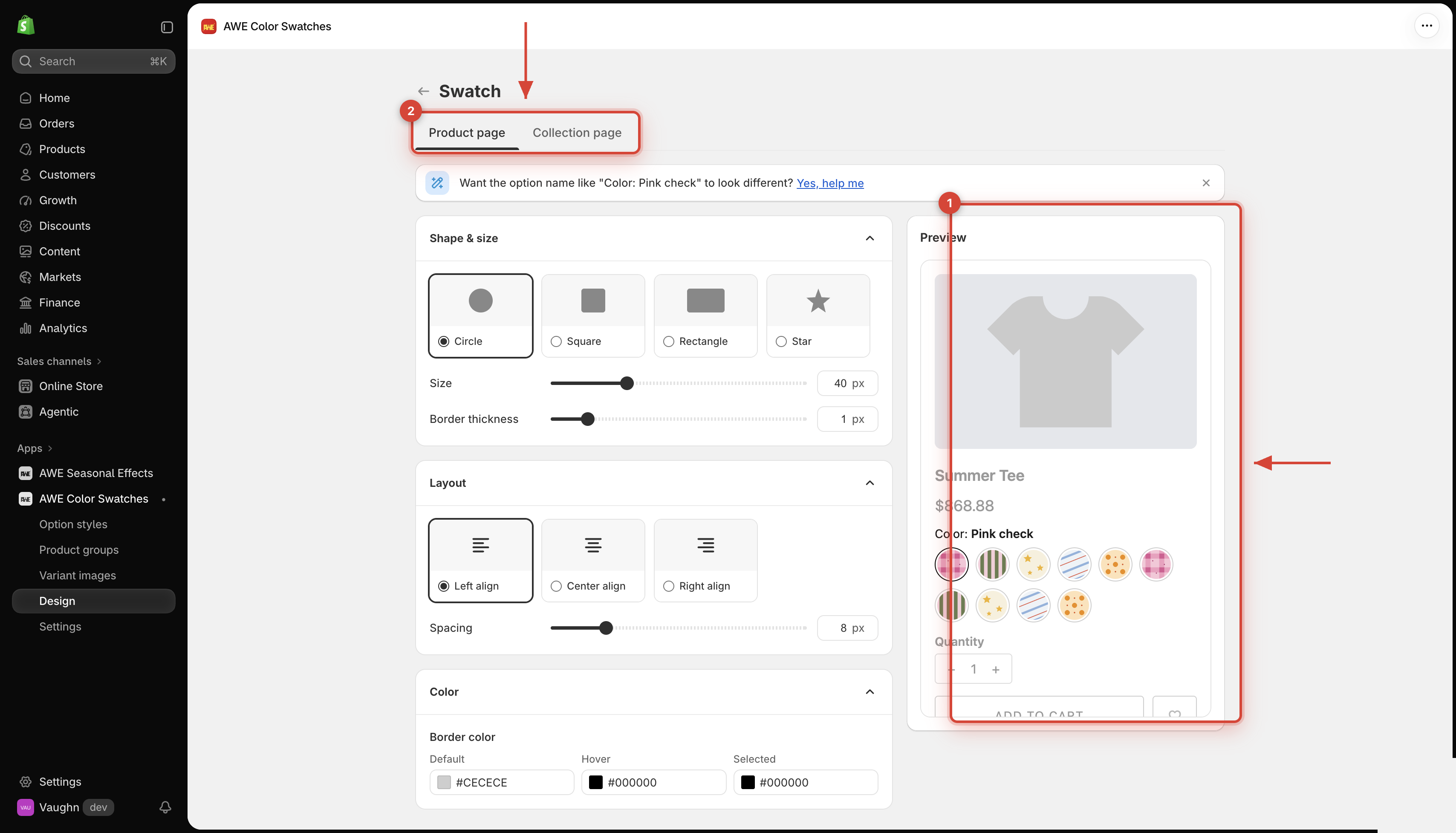
Every style page has two tabs, **Product page** and **Collection page**, each with its own settings — so swatches can be large on the product page and small on collection cards.
→ *One **Save** saves both tabs. Switching tabs never loses your edits.*
## 3. **Live preview**
The **Preview** on the right updates as you change settings, before you save. The **Product page** tab shows a sample product; the **Collection page** tab shows 4 sample product cards.
{% hint style="info" %}
The tooltip, sold-out display and custom CSS are set once for the whole store in [Settings](/awe-color-swatches/getting-started/settings.md) — the preview uses what you saved there.
{% endhint %}
## 4. **Style guides**
{% content-ref url="/pages/WDbKHOdOOrP7tZo9WFsa" %}
[Swatch](/awe-color-swatches/getting-started/design/swatch.md)
{% endcontent-ref %}
{% content-ref url="/pages/CdFRymcangxZFxwOUxwu" %}
[Card](/awe-color-swatches/getting-started/design/card.md)
{% endcontent-ref %}
{% content-ref url="/pages/9YHminOKbkwkacCpt2Hs" %}
[Button](/awe-color-swatches/getting-started/design/button.md)
{% endcontent-ref %}
{% content-ref url="/pages/Jc16XduI0rfsjLd07vXV" %}
[Dropdown](/awe-color-swatches/getting-started/design/dropdown.md)
{% endcontent-ref %}
{% content-ref url="/pages/z26jYXqSI5MgWslEyV0H" %}
[Compact display on collection cards](/awe-color-swatches/getting-started/design/compact-display-on-collection-cards.md)
{% endcontent-ref %}
→ *Want the option name (like "Color: Pink check") to look different? Click **Yes, help me** on the banner at the top of any style page and we'll help you.*
***
💬 If you have any related questions, please contact us via **Live chat** in the app.